Saturday, December 17, 2011
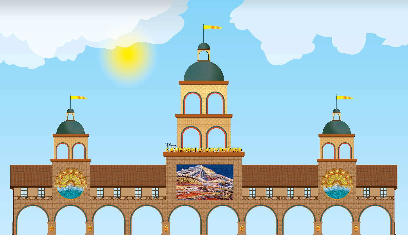
Condor Flats
I don't use textures all that often, so I need some practice. I think texture can add a lot to the right piece, but I'm more prone to go with simple, flat colors. It just feels bolder and braver. But I'll keep playing around with it until I get it right. This is not an example of getting it right. This is an example of "Good try. But let's see some other versions, hmm?" (The inspiration came from mashing the old-school vintage travel posters with California Adventure's Condor Flats area.)
Tuesday, November 8, 2011
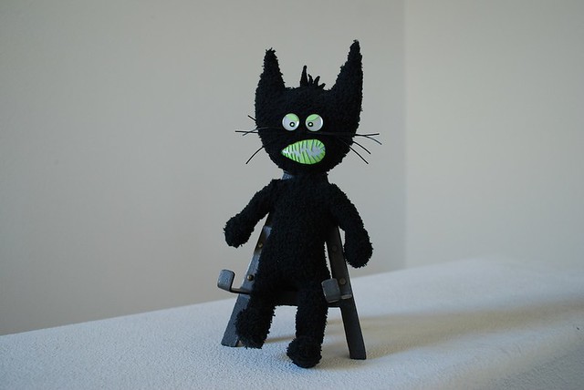
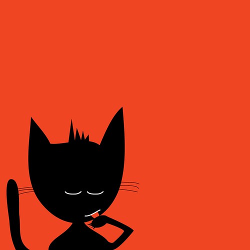
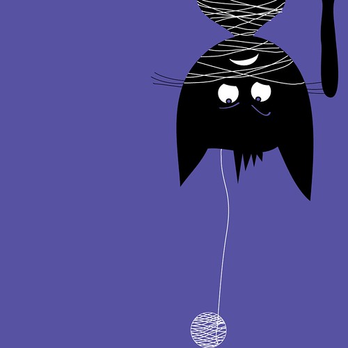
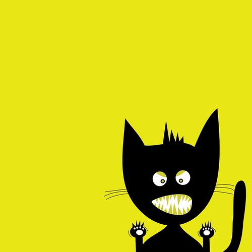
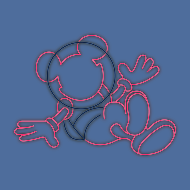
Really Bad Kitty Expressions
Just playing around with different facial expressions for different moods.

Friday, March 4, 2011
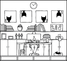
Put a bird on it
I hid a few surprises on my portfolio site, but some of them were so hidden that no one ever found them. Namely, if you clicked the iPad or calendar more than once, you'd get a second image. Click again and you'd get a third. And so on. I thought it would be fun rather than just plain, old bad UI.
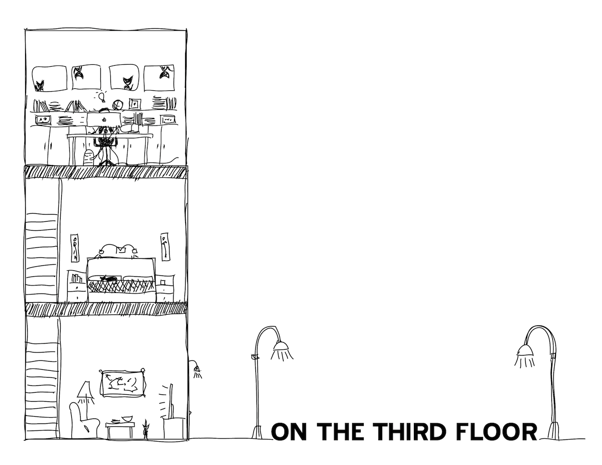
But how do you create navigation for a site that doesn't have menus, dropdowns, or text (except for the mailbox contact page)? It had to be visual and subtle. So I put a bird on it. Hopefully visitors will get that the flying bird equals 'next image, please!' On the Third Floor.

But how do you create navigation for a site that doesn't have menus, dropdowns, or text (except for the mailbox contact page)? It had to be visual and subtle. So I put a bird on it. Hopefully visitors will get that the flying bird equals 'next image, please!' On the Third Floor.
Wednesday, March 2, 2011
New Web Site: A History
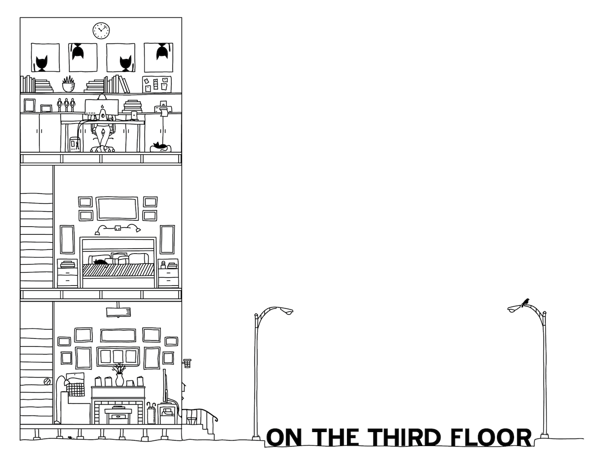
Tuesday, February 22, 5:30 pm: Had third-floor thought, "I need a Web portfolio thingy." Looked up at the ceiling. Pondered. What if the words were stacked like supports and a cutaway of the third floor was on top as a landing page. Hmm. Too messy. What if all three floors were on the left and you just clicked stuff and stuff happened. Took pen to Wacom tablet. Drew initial sketch.

Liked it a lot. Tweaked it a bit. Went downstairs to watch V. Went to bed. In the middle of a terrible book that I'm continuing to read because it makes me fall asleep really, really fast.
Wednesday, February 23, 5:00 am: Played around with the design, coming up with different scenarios. Tried building a mini-version in Dreamweaver to see if I had the technology (I did) and the skills (I didn't) to build it, even as simple as it is. Got frustrated. Got testy. Ate breakfast. Forced myself to jog three miles. Did 200 ab crunches. Ruined ab workout by eating all the leftover pizza. Watched an episode of Grey's Anatomy. Napped with cat.
Same day, 1:30 pm: Pot of coffee. Turned on Subsonic Radio. Re-started Dreamweaver. Grew frustrated again. Began repeating Mike's motto in head, "Desire. Learn. Do. Desire. Learn. Do." Figured out how it could be accomplished! Built a working mini-version. Did more than I needed because it was so damn fun. Showed Mike when he got home from work. Got a thumbs-up (which is like winning an Oscar). Played around with different clicking scenarios.
Same day, 5:00 pm: Gin and tonic. Printed out thumbnails of all work posted to blog/flickr (and some that was not). Decided on the worthy inclusions. Wrote out exactly what needed to be in the final illustration of the landing page. Created multiple layers just to goof around with ideas because gin and tonic will do that to a person. Went to the first floor to watch Survivor and Modern Family. Bed. Continued reading terrible book.
Thursday, February 24, 4:45 am: Started writing this history so that I wouldn't forget all of the monumental achievements. Created paper prototype since it would be easy to get lost and I couldn't illustrate the final piece without knowing all the details.
As with any project, cat had to come lay on it. It's a given. Unavoidable. Some of you know exactly what I mean.

Ate breakfast. Went for four-mile jog, which included a brief stop at Disneyland to ride Pirates of the Caribbean. Got a lucky shot on my iPhone just as the lightning struck. It's a Disneyland-porn money shot, folks.

Same day, 1:00 pm: Pot of coffee. Subsonic Radio. Made all the connections on the paper prototypes. Adjusted some things, removed others. Created blank objects for future growth and toirritate intrigue visitors. Really wanted something for the TV icon, but didn't have just the right thing. Saved it for later. Something good will come.

Visited sites that inspire me. (Grain Edit, Picture Pig, Dude Craft, Passport2Dreams) while the coffee worked its magic. Caught up on my Words with Friends games. (Sorry, everyone! I've totally been doing other things instead of whooping your butts with my vast and superior knowledge of those things you make when you put letters together and stuff.) Tweeted. (@OnThe3rd) Realized that I was stalling. To start a new project, even a planned one, is scary. Wrote more of this history to avoid starting. (See above.) So I did the only thing that seems to work: I pulled out my copy of Art & Fear by David Bayles and Ted Orlando and read the first and last sentence of the book.
Same day, moments later: Started. Drew the outside and the first floor.
Friday, February 25, 5:00am: Finished the first floor. Drew the second floor. Started the third floor. Then I actually had to clean the real house (yes, all three floors) because house guests were arriving for the weekend. And even though I love them, I will resent their presence if I can't work on this. Stopped at noon to shower and wait for Guest #1's arrival, then it's off to Disneyland for the rest of the rainy day. Sorry, Project. I miss you already!
Saturday, February 26, 11:20 am: Guest #1 is at an all-day conference. Guests #2 and #3 are gone. I'm back to drawing. I thought I'd resent their presence more last night, but the positive number of dirty martinis nullified the negative emotions. Drawing more third floor objects. Mike makes first floor suggestions that will take lots of work, but he is right, so the changes must be made. Have to pee every 20 minutes because of all the water being consumed due to aforementioned gin consumption.
Same day, 3:10 pm: Finished. I think. I may completely re-design the first floor. And I haven't added 'me' behind the computer. But after almost four hours, I've got the vector blues. I've done WAY more work than is necessary and all because of a few tiny fun things I want to include. If I didn't include the tiny fun things, this would have been done already. But I'm oddly satisfied with the extra work because I know the user experience will be much more meaningful with the hidden surprises.
Needed a visual reference for the rain scene. Used Photo Burst on the iPhone and myself as the model. Work it, baby! (The artist suffers so much for his work. I'm in a heavy coat on a beautiful Southern California day.)

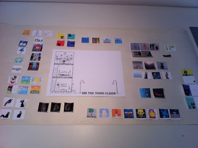
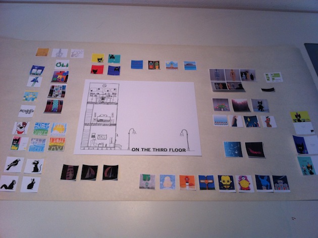
Sunday, February 27, 9:30 am: All house guests are gone. Finished the landing page art! Published it to the server! Looks neat! Now I just have to create 52 separate images, 52 html pages, and many hotspots. It's gonna be quite the afternoon.
Same day, 12:02 pm: 7 out of 52 images complete. Doing all the easy ones first. Not sure that's smart.
Same day, 2:36 pm: 45 images complete. Need libation. Immediately.
Same day, 4:30pm: 3 more to go. But these are the most difficult. More libation, please.
Same day, 6:30 pm: Working as to avoid the Oscars. During the telecast, I spend most of the time cringing behind a pillow because I have a hard time watching actors outside of their medium, like turning 21 and seeing your first grade teacher throw back tequila shots at a bar. It's awkward and uncomfortable for everybody.
Same day, 7:25: All html pages created! (Except for the 3 pieces I haven't completed. But I'm saving them for tomorrow. 1) Because they'll take a lot of time, 2) I want to be fresh, and 3) My DVR is constipated and needs relief.)
Monday, February 28, 4:07 pm: I finished. I published. I tested. Found missed link. Fixed. Looking back on the last seven days, I'm proud. I made my very own interwebz. But I know there will be a Phase 2, one that requires Dreamweaver skills I don't have yet. There should probably be frames so that each page isn't a separate image (for faster loading). But all and all, simple is sometimes better, and I like the little surprises. I've left some room for growth, so Phase 1.5 will probably come way before Phase 2. For now, Phase 1 is kinda awesome for me. And I gave it my best shot, and that makes me very happy.
On the Third Floor

Liked it a lot. Tweaked it a bit. Went downstairs to watch V. Went to bed. In the middle of a terrible book that I'm continuing to read because it makes me fall asleep really, really fast.
Wednesday, February 23, 5:00 am: Played around with the design, coming up with different scenarios. Tried building a mini-version in Dreamweaver to see if I had the technology (I did) and the skills (I didn't) to build it, even as simple as it is. Got frustrated. Got testy. Ate breakfast. Forced myself to jog three miles. Did 200 ab crunches. Ruined ab workout by eating all the leftover pizza. Watched an episode of Grey's Anatomy. Napped with cat.
Same day, 1:30 pm: Pot of coffee. Turned on Subsonic Radio. Re-started Dreamweaver. Grew frustrated again. Began repeating Mike's motto in head, "Desire. Learn. Do. Desire. Learn. Do." Figured out how it could be accomplished! Built a working mini-version. Did more than I needed because it was so damn fun. Showed Mike when he got home from work. Got a thumbs-up (which is like winning an Oscar). Played around with different clicking scenarios.
Same day, 5:00 pm: Gin and tonic. Printed out thumbnails of all work posted to blog/flickr (and some that was not). Decided on the worthy inclusions. Wrote out exactly what needed to be in the final illustration of the landing page. Created multiple layers just to goof around with ideas because gin and tonic will do that to a person. Went to the first floor to watch Survivor and Modern Family. Bed. Continued reading terrible book.
Thursday, February 24, 4:45 am: Started writing this history so that I wouldn't forget all of the monumental achievements. Created paper prototype since it would be easy to get lost and I couldn't illustrate the final piece without knowing all the details.
As with any project, cat had to come lay on it. It's a given. Unavoidable. Some of you know exactly what I mean.

Ate breakfast. Went for four-mile jog, which included a brief stop at Disneyland to ride Pirates of the Caribbean. Got a lucky shot on my iPhone just as the lightning struck. It's a Disneyland-porn money shot, folks.

Same day, 1:00 pm: Pot of coffee. Subsonic Radio. Made all the connections on the paper prototypes. Adjusted some things, removed others. Created blank objects for future growth and to

Visited sites that inspire me. (Grain Edit, Picture Pig, Dude Craft, Passport2Dreams) while the coffee worked its magic. Caught up on my Words with Friends games. (Sorry, everyone! I've totally been doing other things instead of whooping your butts with my vast and superior knowledge of those things you make when you put letters together and stuff.) Tweeted. (@OnThe3rd) Realized that I was stalling. To start a new project, even a planned one, is scary. Wrote more of this history to avoid starting. (See above.) So I did the only thing that seems to work: I pulled out my copy of Art & Fear by David Bayles and Ted Orlando and read the first and last sentence of the book.
- First sentence: Making art is difficult.
- Last sentence: In the end it all comes down to this: you have a choice between giving your work your best shot and risking that it will not make you happy, or not giving it your best shot - and thereby guaranteeing that it will not make you happy.
Same day, moments later: Started. Drew the outside and the first floor.
Friday, February 25, 5:00am: Finished the first floor. Drew the second floor. Started the third floor. Then I actually had to clean the real house (yes, all three floors) because house guests were arriving for the weekend. And even though I love them, I will resent their presence if I can't work on this. Stopped at noon to shower and wait for Guest #1's arrival, then it's off to Disneyland for the rest of the rainy day. Sorry, Project. I miss you already!
Saturday, February 26, 11:20 am: Guest #1 is at an all-day conference. Guests #2 and #3 are gone. I'm back to drawing. I thought I'd resent their presence more last night, but the positive number of dirty martinis nullified the negative emotions. Drawing more third floor objects. Mike makes first floor suggestions that will take lots of work, but he is right, so the changes must be made. Have to pee every 20 minutes because of all the water being consumed due to aforementioned gin consumption.
Same day, 3:10 pm: Finished. I think. I may completely re-design the first floor. And I haven't added 'me' behind the computer. But after almost four hours, I've got the vector blues. I've done WAY more work than is necessary and all because of a few tiny fun things I want to include. If I didn't include the tiny fun things, this would have been done already. But I'm oddly satisfied with the extra work because I know the user experience will be much more meaningful with the hidden surprises.
Needed a visual reference for the rain scene. Used Photo Burst on the iPhone and myself as the model. Work it, baby! (The artist suffers so much for his work. I'm in a heavy coat on a beautiful Southern California day.)

Sunday, February 27, 9:30 am: All house guests are gone. Finished the landing page art! Published it to the server! Looks neat! Now I just have to create 52 separate images, 52 html pages, and many hotspots. It's gonna be quite the afternoon.
Same day, 12:02 pm: 7 out of 52 images complete. Doing all the easy ones first. Not sure that's smart.
Same day, 2:36 pm: 45 images complete. Need libation. Immediately.
Same day, 4:30pm: 3 more to go. But these are the most difficult. More libation, please.
Same day, 6:30 pm: Working as to avoid the Oscars. During the telecast, I spend most of the time cringing behind a pillow because I have a hard time watching actors outside of their medium, like turning 21 and seeing your first grade teacher throw back tequila shots at a bar. It's awkward and uncomfortable for everybody.
Same day, 7:25: All html pages created! (Except for the 3 pieces I haven't completed. But I'm saving them for tomorrow. 1) Because they'll take a lot of time, 2) I want to be fresh, and 3) My DVR is constipated and needs relief.)
Monday, February 28, 4:07 pm: I finished. I published. I tested. Found missed link. Fixed. Looking back on the last seven days, I'm proud. I made my very own interwebz. But I know there will be a Phase 2, one that requires Dreamweaver skills I don't have yet. There should probably be frames so that each page isn't a separate image (for faster loading). But all and all, simple is sometimes better, and I like the little surprises. I've left some room for growth, so Phase 1.5 will probably come way before Phase 2. For now, Phase 1 is kinda awesome for me. And I gave it my best shot, and that makes me very happy.
On the Third Floor
Tuesday, March 1, 2011
Friday, February 25, 2011
Work-in-Progress: Landing Page
I've been meaning to create a portfolio-style Web site for some of my best pieces. You know, as a way to show off appear more professional to rich benefactors potential clients/employers. So I ended up sketching a few ideas. This one is in the lead.
Thursday, February 24, 2011
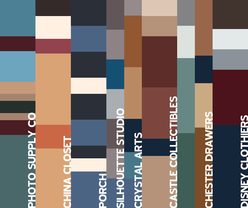
The Colors of Main Street, USA, Disneyland (east side)
Blast! I thought I'd complete the 'Street' by doing the other side, but I should have been paying more attention. There are WAY more facades on the east side than the west, and some don't even have names. So there's no symmetry with all four pieces. And it took much more time since there are five more facades than the other side. (If you're a die-hard fan, you'll notice I skipped one altogether. My apologies.)


Wednesday, February 23, 2011
Tuesday, February 22, 2011
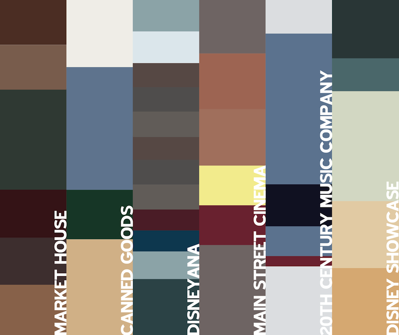
The Colors of Main Street, USA, Disneyland (west side)
I was working on a project having to do with a simplified, illustrated version of Main Street, USA, at Disneyland. So as part of my marathon training, I ran to Disneyland (2.25 miles) with my iPhone, paused my Nike+ app and entered the park to take some pictures of Main Street. After jogging home, I pulled out the colors of each section for the project. Then I thought it would be pretty cool to have a swatch-based piece for fun. So I started a completely different project!
Keep in mind that it's an iPhone and a cloudy day. So in no way should this be considered a replication of the exact colors. Total approximation here, folks. The top image is the southwest portion, the bottom the northwest.
The amount of each swatch is based on the percentage of that color that my eye sees when I go a little cross-eyed and blurry. I probably should have had an adult beverage; it might have improved my accuracy.
Monday, February 21, 2011
Wednesday, February 16, 2011

Tuesday, February 15, 2011
Disneyland's Star Traders Neon Mural
Thought it would be a fun little project to recreate the neon mural on the side of Star Traders in Tomorrowland at Disneyland. (And by fun I mean, five hours of exacting vector work.) Might make a cool animated gif, too.
Monday, February 14, 2011
Walt Disney's Enchanted Tiki Room Part 3
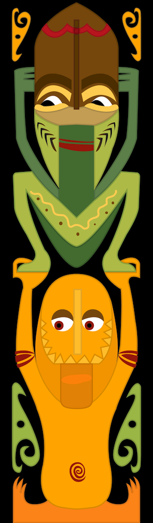
I was told that the original totem dudes needed some totem buddies. So here's the latest pledges to the ongoing Tiki Room fraternity.

Friday, February 11, 2011
Disney California Adventure Entrance Concept
I love the idea of the Pan Pacific Auditorium as an entrance to a theme park. California Adventure is getting just that. But that idea is already in use at Disney's Hollywood Studios in Florida.
I think California Adventure deserves its own unique entrance. This is just a concept of my own invention by using bits of inspiration from all over California.
I think California Adventure deserves its own unique entrance. This is just a concept of my own invention by using bits of inspiration from all over California.
Click the picture for a bigger view.
Thursday, February 10, 2011
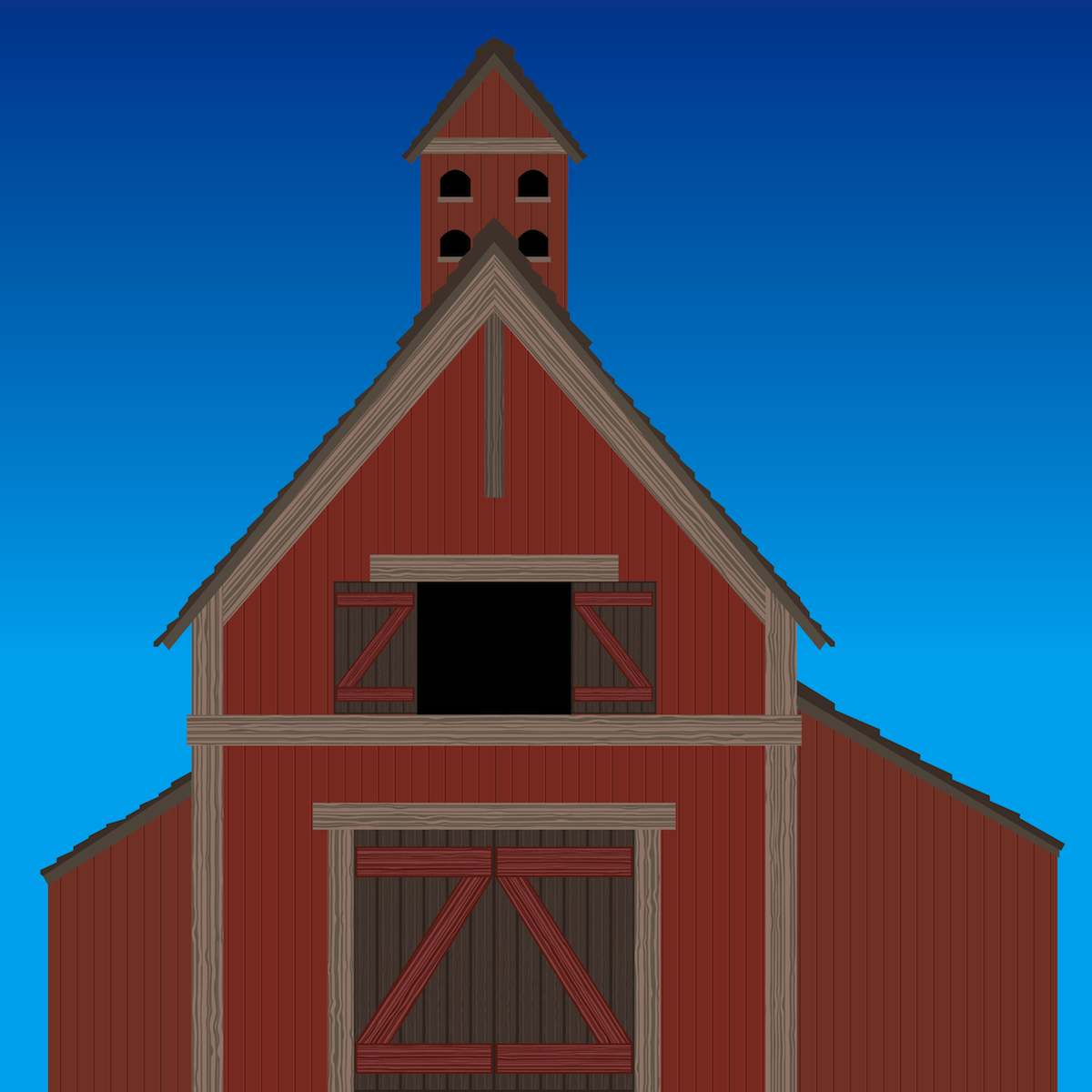
Disneyland's Splash Mountain
This design is actually based on the original model of Splash Mountain entrance barn before it was built, so some of the coloring and design is a bit different than what was actually constructed. My main goal was really just to make some vector wood grain since I had never done it.
Wednesday, February 9, 2011
Disneyland's Submarine Voyage
Here's an old school submarine from Disneyland's Submarine Voyage with a little nod to the current attraction.
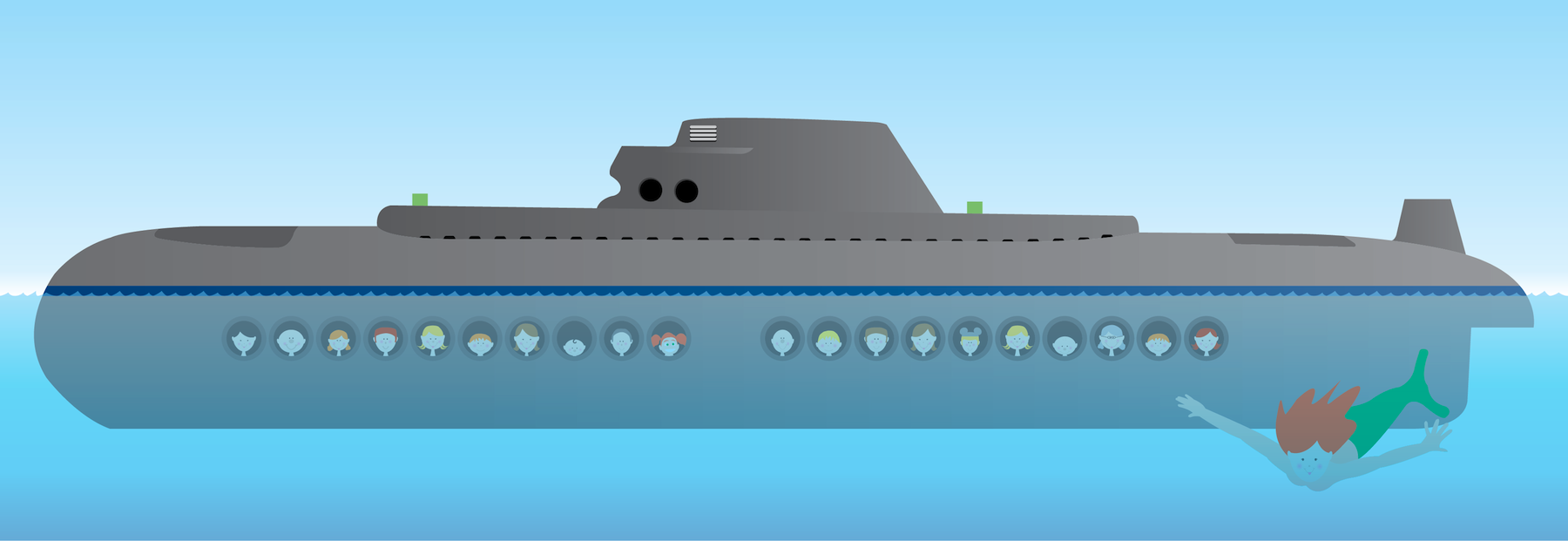


Click the pic for a bigger version.
I was hoping to incorporate some foreground or background detail and thought nautical flags would be cool if done right. I ended up passing on that idea, but I had already made the flags. Each flag stands for a letter. And, yes, you guessed it, the letters spell out SUBMARINE VOYAGE.
Disney has a history of referencing a piece of attraction history if something new replaces something old. In 'The Many Adventure of Winnie the Pooh" at Disneyland, the original Max, Melvin and Buff are hidden above and behind the riders. You can't see them unless you turn around. In the 'Indiana Jones Adventure,' there's an old Eeyore sign in the projector room as a wink to the fact that the show building for the attraction takes up the former Eeeyore parking lot. In this case, I wanted to play with the reverse and have an old attraction contain a nod to a future one. Darla from 'Finding Nemo' has a porthole all her own.
Tuesday, February 8, 2011
Walt Disney's Enchanted Tiki Room Part 2
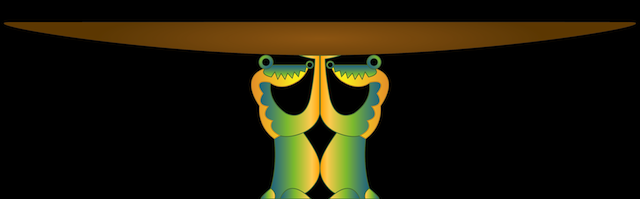
These crocodiles are actually on a singing totem pole. I have them holding up a bowl here for a specific purpose on a side project. I think they are adorable, but I'm not in love with my gradient work.
Monday, February 7, 2011
Walt Disney's Enchanted Tiki Room
While working on a little side project, I needed an original graphic inspired by Walt Disney's Enchanted Tiki Room. It's one of my favorites and makes me miss Country Bear Jamboree and America Sings, the kinds of attractions I wanted my niece and nephew to experience.
Saturday, February 5, 2011
New Project Updated Again
I keep re-doing this. And I'm finally quite happy with the latest version. I'm not 100% happy. I'm 78% sure that I'm 100% done with messing around with this though. At least, that's what 23% of my brain says.
Friday, February 4, 2011
New Project
Working on a little side project. This is just an initial design. A look-and-feel kind of thing with heavy influence from a certain Disneyland attraction.

Sunday, January 30, 2011
Sunday, January 23, 2011
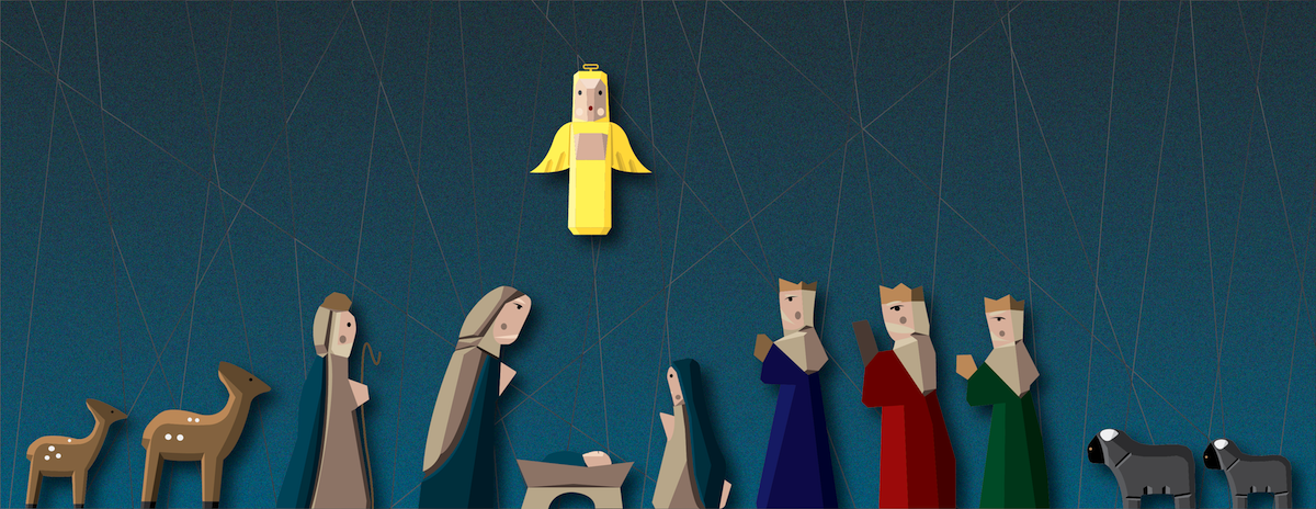
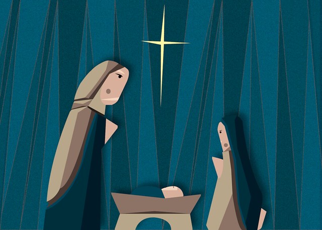
Work-in-Progress: Nativity Background
Well, I've been having all sorts of trouble coming up with a reasonable background for the Nativity figures. I guess it's hard to be inspired when it's late January and the temperature is a perfect 76 degrees. Just not feeling all that Christmas-y. It's also difficult to come up with something that is abstract enough to fit the style of the figures but not so abstract and busy that it competes with the colors. Here's the first pass.
Subscribe to:
Posts (Atom)