Showing posts with label Illustrator. Show all posts

Tuesday, June 5, 2012

Main Street Junior

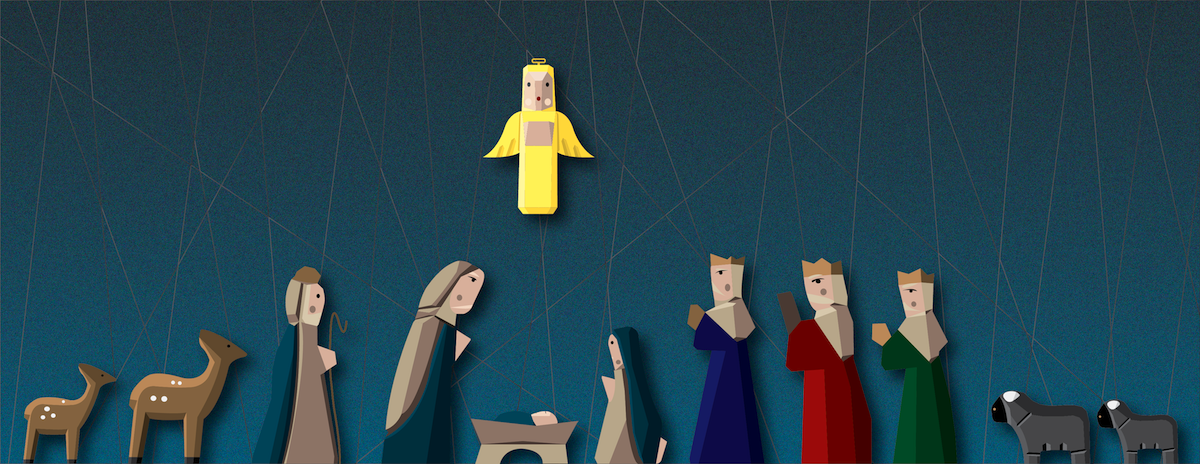
On a trip to Disneyland, I spotted this folding screen in one of the Main Street windows.


It reminded me of what a stylized Mary Poppins cartoon might look like. I don't have the tools to build a version for myself, but it inspired a digital vision of a Main Street Jr.


I think it's adorable. If I were a kid, I'd want this as a playset. Heck, I want it as a grown-up kid! It may never make it into the physical world, but I needed a reason to use the color study I did of Main Street.

Saturday, March 31, 2012

Really Bad Bat

Finished a new design for a subsequent painting as a housewarming present for a bat-crazy friend. (He's not actually crazy; he just likes bats.)

Wednesday, January 11, 2012

The Punisher Had a Cousin on his Mother's Side

Was driving home from lunch with the other half and saw a beat-up truck with a Punisher sticker on it. My brain went, "Zpppppffttt." What if the Punisher had a cousin? A horribly buck-toothed cousin. That'd be kinda funny. So I Google-seached my butt off trying to find out if someone had already done it. Didn't seem like it. So I made this.


Then I added some texture for extra buck-toothiness.


The Original Punisher

Saturday, December 17, 2011

Condor Flats

I don't use textures all that often, so I need some practice. I think texture can add a lot to the right piece, but I'm more prone to go with simple, flat colors. It just feels bolder and braver. But I'll keep playing around with it until I get it right. This is not an example of getting it right. This is an example of "Good try. But let's see some other versions, hmm?" (The inspiration came from mashing the old-school vintage travel posters with California Adventure's Condor Flats area.)


Tuesday, November 8, 2011

Really Bad Kitty Expressions

Just playing around with different facial expressions for different moods.

Wednesday, December 1, 2010

The Bug Collection

A few more cute bugs joined the family: caterpillar, grasshopper, and ant.


Monday, November 29, 2010

Friday, May 14, 2010

Iris

Wanted to practice some gradient and pattern skills in Illustrator.  Love irises.  And they're very gradient-y. Working on this I realized that I can't wait to update to the new version of Illustrator so that I can use the new 'draw within' feature.  Even though it only takes a few more steps, I just didn't feel like creating a mask for the veins.

Wednesday, April 28, 2010

There's No School like the Old School

EPCOT Center.  Circa 1989.  Ahh.  Magic.

And each Future World pavilion used to have its own logo.  Simple and pure and genius.  Here's a wallpaper for your magical iPad in honor of this great time in history.


Click here to download to whatever folder syncs with your magical iPad.

iPhone Version!


Click here to download to whatever folder syncs with your amazing iPhone.

Dreamfinder would be happy.


Monday, April 26, 2010

Updated Design

Got a magical iPad for my birthday.  Somebody loves me.  Now I just have to go down to Starbucks with it so everyone can see me using it.  ;)  But now I can test my designs!  Which led to this update of the too-busy, colorized Tomorrowland Terrace.  This looks WAY better on the magical iPad.


Click here to download to whatever folder syncs with your magical iPad.


The magical iPad

Friday, April 23, 2010

Tomorrowland Terrace

I was goofing off in Illustrator today and decided to do something based on the art direction of Disneyland's Tomorrowland in the 60s.  This is an ode to the Tomorrowland Terrace stage, the one that rises from the ground just as the band starts rockin'!  Groovy, man!  (It's iPad-sized once again.)

Click here to download to whatever folder syncs with your magical iPad.

Wednesday, April 21, 2010

It's Fun to Be Free

I fell in love with EPCOT Center during my first visit in 1988.  What an immense playground for the mind and heart!  Each pavilion brought new use of technology to tell a story or share information in an amazing way.  Sadly, the place has very few wonders left in it.  Most of Future World has been stripped of its elegance and spirit.  Although World of Motion was not a favorite of mine, it believed in itself.  And it believed in you.  And that's worth celebrating.  So I made a little illustration of its grand facade, simple and striking.  (Not to scale.  At all.)


Tuesday, April 20, 2010

Peoplemover Vehicles

Just messing around in Illustrator with an iPad-sized canvas.  I miss the Peoplemover at Disneyland.  It gave the whole area movement and life.  And the ride itself was a fantastic getaway from the people below.  You kind of felt a bit superior riding around over all the guests.  AND you could spot the short lines and plan your next move.  Hope they bring it back.  If not, enjoy it on your iPad.


Click here to download it to whatever folder syncs with your iPad.

Friday, April 16, 2010

Grendelfish Brushes

In the Grendelfish post, I mentioned I thought it would be cool to make a brush out of the roughened edge of the logo.  I gave it a shot.


Thursday, April 15, 2010

Grendelfish

When I was 19, I wrote a play about pirates.  The basic premise was that a group of male pirates rescues a group of female pirates (who lost their ship in a severe storm).  A high-seas battle-of-the-sexes and hilarity ensues!  (I know, right?  Hey, I was 19.)  Anyway, when the crews weren't battling each other, they were battling Grendelfish, an evil sea serpent with glowing yellow eyes.

The best thing to come out of all this was the logo I designed. ;)  I still think it's pretty cool.

Interesting side note: I designed it in Illustrator 5.  What was that?  Like 1993 or something.  Anyway, all I had in my file cabinet was a printed version.  I scanned it, and then opened it in Illustrator CS4.  Illustrator auto-traced it and then I clicked Expand.  And that was it.  No cleanup required.  We've seriously come a long way.  And somehow I gotta figure out how to get that edging into a brush stroke, cuz that's just plain awesome.


Interesting side note 2: See the graphic at the very top, the one that says 'On the Third Floor'? Notice the F and L are 'combined.'  Now look at this graphic.  The L and F are 'combined.'  17 years separate these pieces.  That is really quite creepy.  Do I require therapy to deal with my inherent need to get Ls and Fs up in each others' business?

Friday, April 9, 2010

Another iPad Wallpaper

Why am I doing this to myself?  I don't even own one!  It really is fun having a new canvas size for some reason.  Oh yeah, and why is it 1024x1024?  I've read that when you turn the thing on its side, it doesn't resize the wallpaper to enlarge it if it were 1024x768; it shrinks it and gives it a letterbox feel.  Again, haven't tested it.  Not completely in love with the 'starburst.'  Hmmm.  It may come out.


Click here to download to whatever folder syncs with your iPad.

Wednesday, April 7, 2010

i heart iPad Wallpaper

I don't own an iPad, so I couldn't test this.  But it should work beautifully no matter the orientation.  I created two masks for both orientations and aligned the graphics to look good even if you're spinning your iPad like a basketball on your finger.  (But don't do that.  It's kind of expensive.)  Not sure what the image will do when it actually orients itself.  Think I need to buy one.  For research purposes.  Yeah, research purposes.


Click here to download to whatever folder syncs with your fabulous new iPad, you lucky dog.